I have continued on with the website this morning and added a couple more animations throughout, in order to keep the site interesting. Due to creating more of an interactive instruction manual that I want to follow on with a game, after deadlines, I am going to create an advert for the up and coming game, of which I will preview on the website. 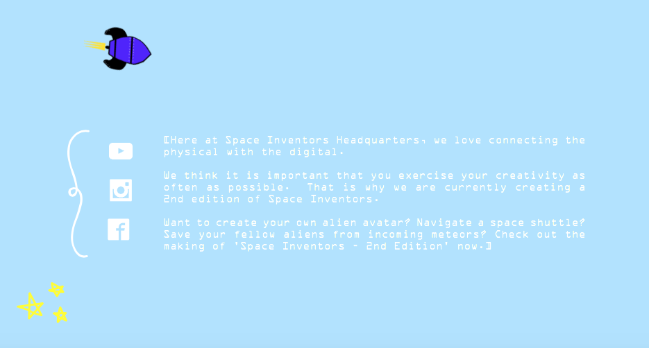
On the home page, at the bottom, I have provided this information. I think it is important to create a facebook and instagram page as well as link it to a youtube channel, due to potentially reaching out to more of an audience. A lot of young children use social media and even though they aren’t the main users, the teachers that will consider using this assignment in class are frequent users.
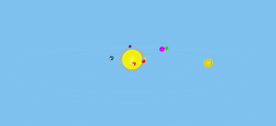
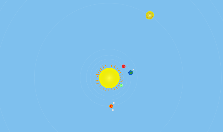
I briefly went on to creating the facts pages about each planet, however have only completed the section on planet Earth. I like the layout of these pages, however I plan to make them more interactive down the line. I really want to incorporate an animating solar system, somewhere in the website however I was tackle that task next week. I might even include this on the planets information page and make toggles so you can switch between each planet. This is what the planet Earth page looks like so far:
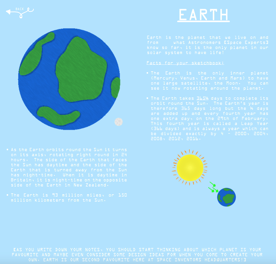
Obviously this is a still image and therefore you cannot see the animations, however the moon is rotating 360 degrees around earth and the smaller earth is rotating at 360 degrees every two seconds, whilst the rays of sun move to and from the planet. This is a demonstration of how seasons/day and night work.
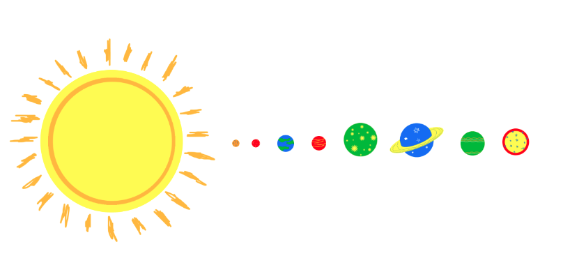
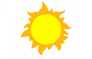 The first sun was drawn quickly, without much thought. I like the colours and they provide easy connotations of what the image is supposed to represent. After designing this sun, I wanted to create another, with the same colour scheme and basic jist, but with a different element of ‘doodling’. Therefore, I did a little more research and looked at previous doodles that I had created. I decided, going with the more ‘drawn’ look was appropriate. I drew two basic circles and quickly sketched some beams coming off the sun, to look like they had been drawn on with colouring pencil. I like this design more as it is more appropriate to the theme I want to give my product. I will now draw the rest of the planets, with this style in mind and begin working on some sort of product branding.
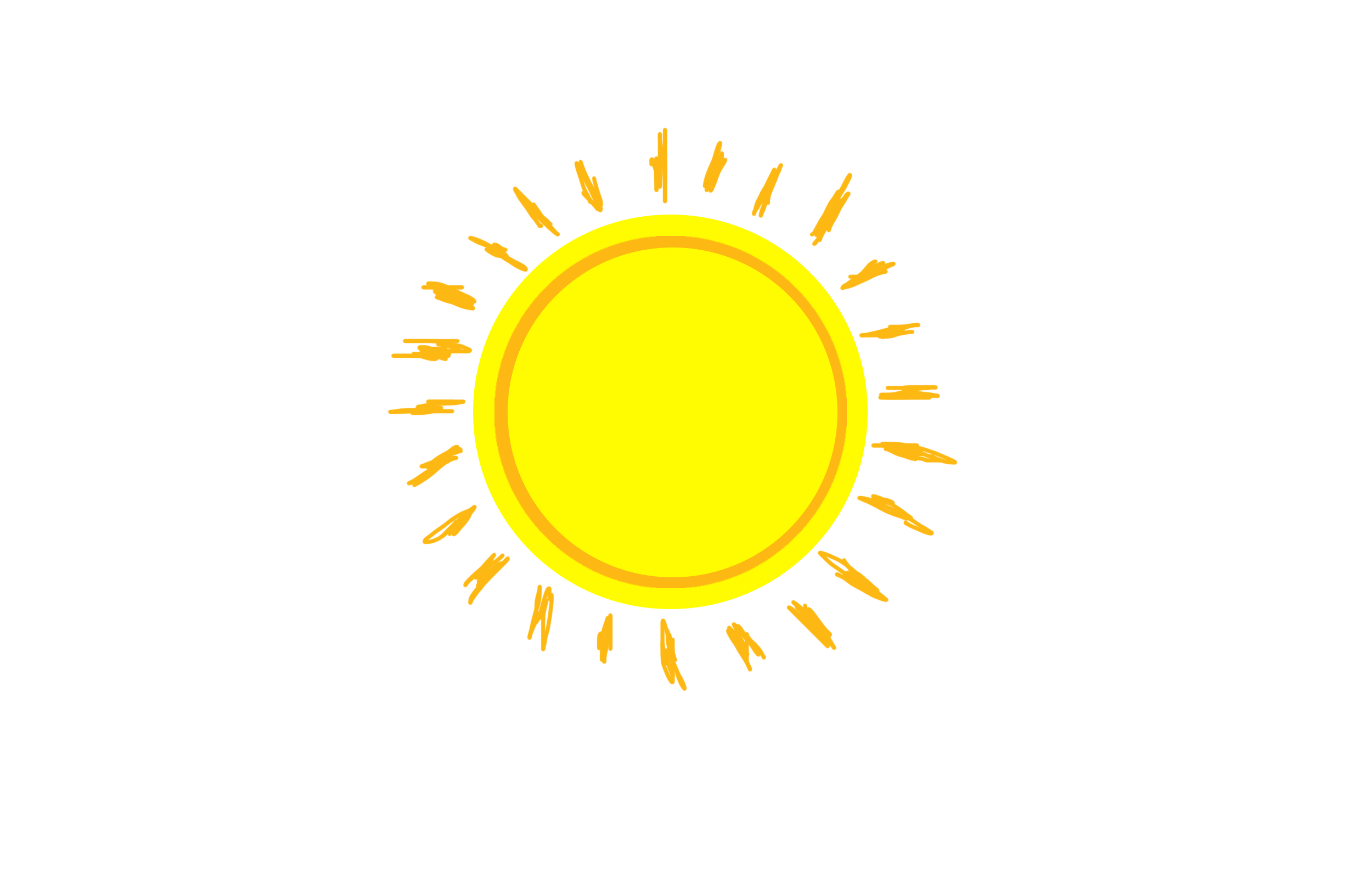 The orange wasn’t originally part of the colour scheme that I wanted to use, however I will continue to add smaller quantities of colour outside of that scheme and make the main details and presentation follow it. This is due to working on a particular subject that enhances the use of colours. I can’t make each planet look the same, it would take the point of using one’s creativity and imagination, away from the intended proposal.