Doodle research

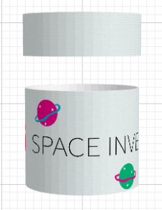
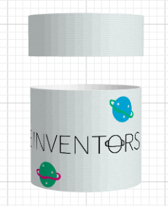
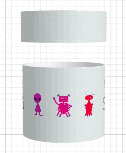
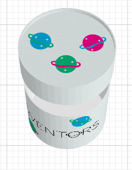
After some research into Justin Bieber’s music video, I decided to have a little doodle myself. I went with the style of what doodles might look like on the front of a school science book, attempting to make them as random as possible. I did this on photoshop and explored the brush and pen tools, however due to the drawings purposely being childlike, I didn’t experiment much with the software. I really like this design style, although I intend to explore it more thoroughly. This research could include looking through old school books of mine from primary school and checking for any doodles, so that the design will reach my target audience as much as possible.

Screen Shot 2016-02-21 at 16.12.58

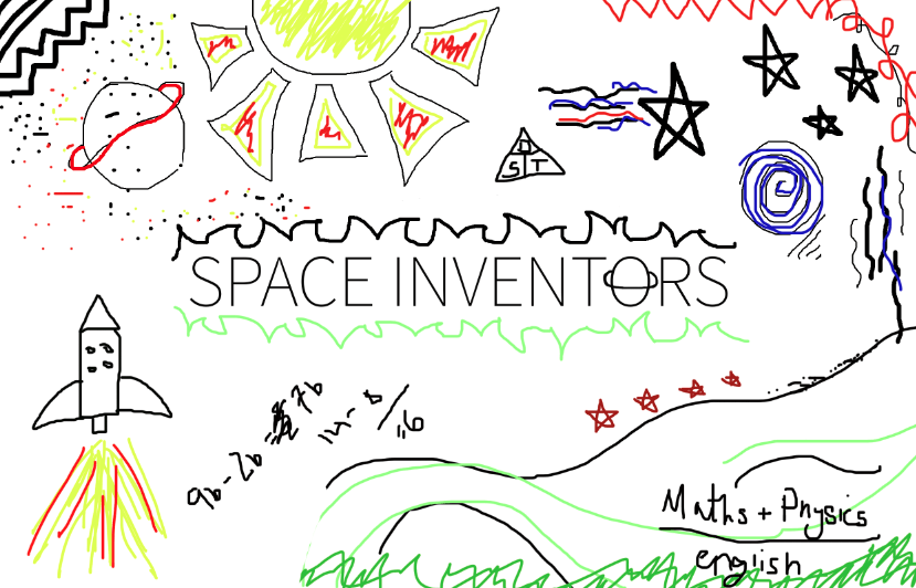
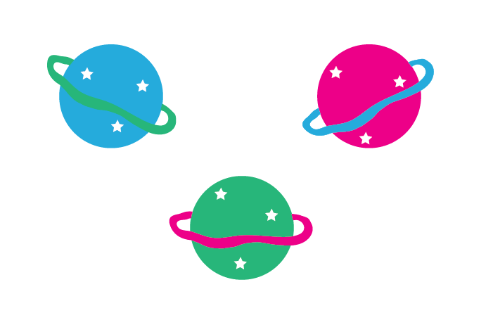
I like the use of the eclectic and bright colours, as they connote symbols of playful colouring in books and doodling as a child. The lack of colour scheme is effective, due to children usually choosing colours to use at random. I am yet to decide on whether I will go down the route of a colour scheme in order to provide my product with some consistent branding. I may choose 5-6 colours and stick with those, including basic reds, yellows, green and blues. Although previous designs included more of a scheme, following on from pink, blue and green.

More research to take place on this style of design, however I really like it and really think it works well alongside the product I want to create.

Doodle research

packaging research

Due to wanting to progress down the route of creating an ‘instruction manual’, that ultimately creates a workshop experience. I wanted to briefly look at packaging designs, as all the pieces that you would need would be included. For example, paint, balls, sticks, glue, paintbrushes, sketch book, information to link to the webpage etc. Therefore, if each child/school had one of these boxes, it would not only potentially look great as decoration, it would be great for arts/crafts storage afterwards too.

I used designyourownpackaging.com to make a quick mock up of what it could potentially look like. I haven’t nearly completed the design stage and believe that will continue to progress, right the way through this semester. However, I made do with what I already had.

I decided to go with a cylinder shape, due to the obvious connotations of working with spheres, as well as looking more attractive. I believe the logo (not yet complete) would be centered, being wrapped around the box and play the main part of the design. Overall, I like how simplistic this design is, and even though this is just a prototype, it ties in nicely to my overall ideas.

Screen Shot 2016-02-19 at 15.44.02

Screen Shot 2016-02-19 at 15.44.13


Screen Shot 2016-02-19 at 15.44.27 Screen Shot 2016-02-19 at 15.44.42

packaging research

Design continued…

After having a browse around ‘Behance’, I found some inspiration for the style of design I would like to make consistent throughout this project. I have decided to follow on with 2D vector images, as they look great and are specifically aimed at my preferred target audience of younger children. Although I worked with 2D vector images last semester, I think keeping near enough a similar style is OK, as long as my designs are completely different. I originally wanted to work mainly with 3D images, purely down to planets being 3D and it being hard to portray them in 2D vision. However, I can later include 3D aspects to how they are seen on screen, in order to create the biggest learning outcomes possible. I can’t create something that tricks children into thinking planets are flat, so it is important that I am very careful in handling this approach.

Screen Shot 2016-02-09 at 14.57.29

Below are some quick images I made up in Adobe Illustrator and I think they look the part with regard to the idea of my project and the audience I am trying to reach out too. More designs will follow as I find more and more inspiration 🙂


Design continued…

Logo design take 2…

I have been playing around in photoshop with different designs for my logo. I have decided to keep the font, size and colour of the title consistent, purely based on the fact that i’m really happy with the simplicity of it. However, that doesn’t go on to mean that I want the overall design to be simple too, as long as the title is clear, easy to read and understand, then young children will be able to interact with it easily.

I decided I wanted to incorporate something ‘spacey’, due to the spark that will go off in a child’s mind, when they realise the subject area. Space is unknown to the majority of us and even though research suggests many thing, on the grand scale of things, we don’t know very much. Therefore, I want young children to get excited about the prospect of learning something that is ‘different’ and sometimes without logic.

1.

Screen Shot 2016-02-08 at 17.01.31


The first design I went with was just a little crowded, there was too much going on and I couldn’t find a simple font colour that fit with the background image. I like that it is obviously unrealistic however, due to encouraging children to create their own solar system and name planets as they wish to.

2.

Screen Shot 2016-02-08 at 17.00.01


This second design was inspired by watching way too many documentaries. It lacks originality and doesn’t exaggerate space, just earth. I really love this image though.

3.

Screen Shot 2016-02-08 at 17.02.59


This is my third design and I really like it. It isn’t my final design however. In my second year of university, I underwent a photography project, that I titled ‘make a wish’ and it was all different elements of why we make wishes and the myths surrounding them. One myth, was the shooting star. I created an image that was obvious to the theme, but not too obvious, with an intergalactic background. This photography project, sparked my inspiration for this potential design.

I will continue to develop my ideas and work on my designs as my research progresses.

Logo design take 2…

First Logo Design

Screen Shot 2016-02-01 at 16.44.02

I am not completely settled on this name for my project this semester, however I decided to have a play with some potential design ideas. I really like how simple this is and how it reflects the aim of the game, quite obviously. I love the font as it is easy to read and can start creating a branding element for my project, if I continue to use this specific style. The use of the ‘O’ in ‘Inventors’ allowed me to focus on a planet style theme, which is maybe a little cliche, however it works with the target audience I have researched thus far. I will continue drawing up different logo designs for this project, to show I have explored my options and worked with different tools/software. This was created in Indesign. Next stop, photoshop.

First Logo Design