I have been playing around in photoshop with different designs for my logo. I have decided to keep the font, size and colour of the title consistent, purely based on the fact that i’m really happy with the simplicity of it. However, that doesn’t go on to mean that I want the overall design to be simple too, as long as the title is clear, easy to read and understand, then young children will be able to interact with it easily.
I decided I wanted to incorporate something ‘spacey’, due to the spark that will go off in a child’s mind, when they realise the subject area. Space is unknown to the majority of us and even though research suggests many thing, on the grand scale of things, we don’t know very much. Therefore, I want young children to get excited about the prospect of learning something that is ‘different’ and sometimes without logic.
1.
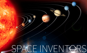
The first design I went with was just a little crowded, there was too much going on and I couldn’t find a simple font colour that fit with the background image. I like that it is obviously unrealistic however, due to encouraging children to create their own solar system and name planets as they wish to.
2.
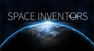
This second design was inspired by watching way too many documentaries. It lacks originality and doesn’t exaggerate space, just earth. I really love this image though.
3.
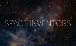
This is my third design and I really like it. It isn’t my final design however. In my second year of university, I underwent a photography project, that I titled ‘make a wish’ and it was all different elements of why we make wishes and the myths surrounding them. One myth, was the shooting star. I created an image that was obvious to the theme, but not too obvious, with an intergalactic background. This photography project, sparked my inspiration for this potential design.
I will continue to develop my ideas and work on my designs as my research progresses.