I have started to create all the assets needed, before I begin the build of my online ‘interactive instruction manual’. I decided to start with the sun and as i’m going down the route of doodle design, I though mocking up more than one idea would be appropriate.
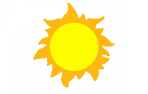 The first sun was drawn quickly, without much thought. I like the colours and they provide easy connotations of what the image is supposed to represent. After designing this sun, I wanted to create another, with the same colour scheme and basic jist, but with a different element of ‘doodling’. Therefore, I did a little more research and looked at previous doodles that I had created. I decided, going with the more ‘drawn’ look was appropriate. I drew two basic circles and quickly sketched some beams coming off the sun, to look like they had been drawn on with colouring pencil. I like this design more as it is more appropriate to the theme I want to give my product. I will now draw the rest of the planets, with this style in mind and begin working on some sort of product branding.
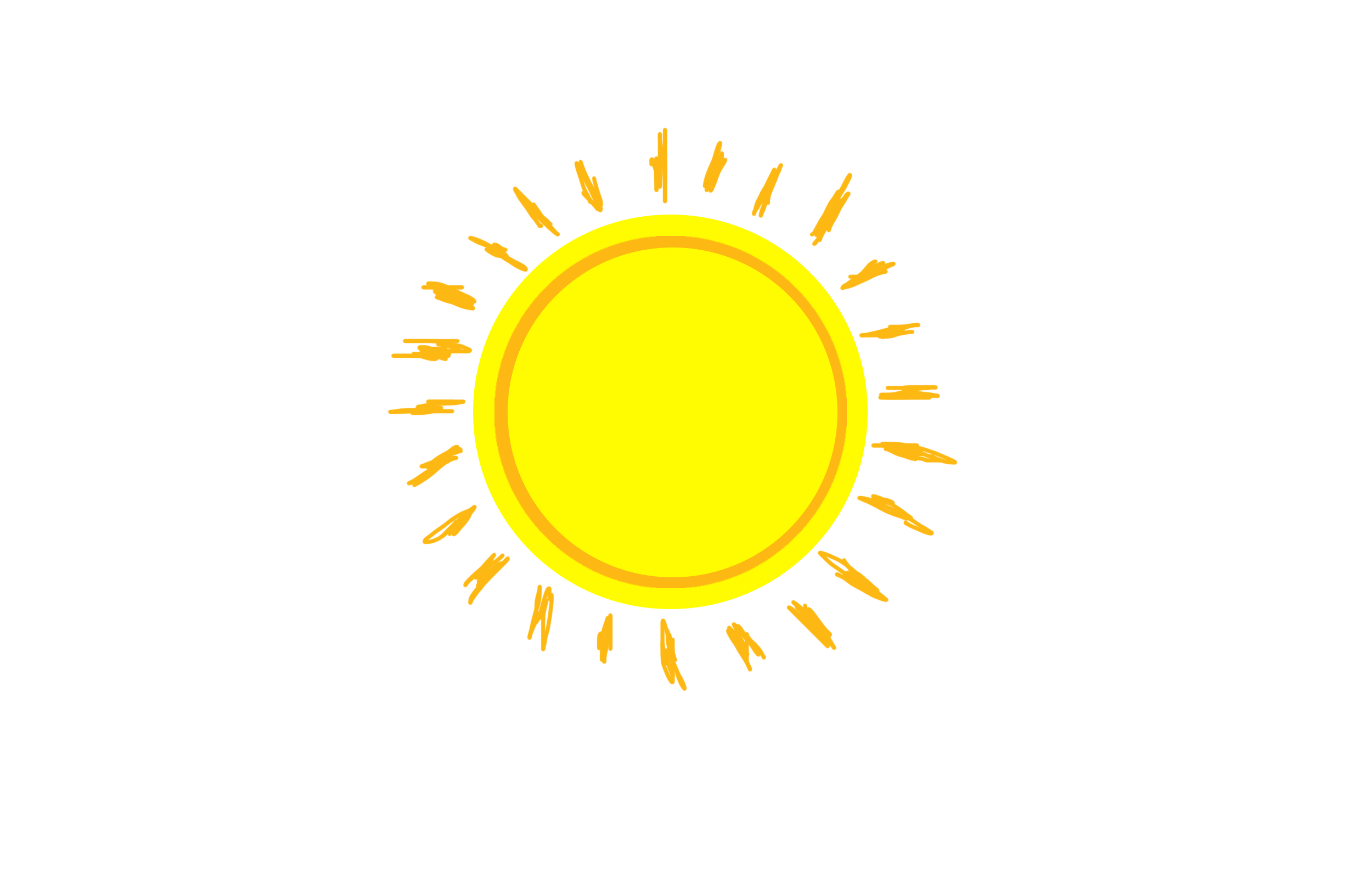 The orange wasn’t originally part of the colour scheme that I wanted to use, however I will continue to add smaller quantities of colour outside of that scheme and make the main details and presentation follow it. This is due to working on a particular subject that enhances the use of colours. I can’t make each planet look the same, it would take the point of using one’s creativity and imagination, away from the intended proposal.