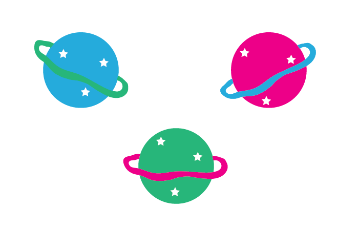
After having a browse around ‘Behance’, I found some inspiration for the style of design I would like to make consistent throughout this project. I have decided to follow on with 2D vector images, as they look great and are specifically aimed at my preferred target audience of younger children. Although I worked with 2D vector images last semester, I think keeping near enough a similar style is OK, as long as my designs are completely different. I originally wanted to work mainly with 3D images, purely down to planets being 3D and it being hard to portray them in 2D vision. However, I can later include 3D aspects to how they are seen on screen, in order to create the biggest learning outcomes possible. I can’t create something that tricks children into thinking planets are flat, so it is important that I am very careful in handling this approach.
Below are some quick images I made up in Adobe Illustrator and I think they look the part with regard to the idea of my project and the audience I am trying to reach out too. More designs will follow as I find more and more inspiration 🙂
