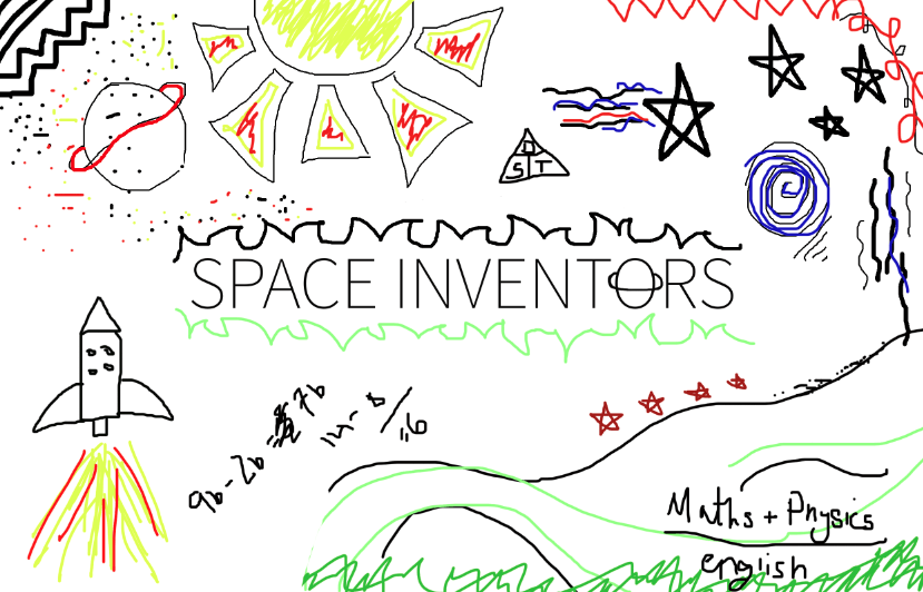
After some research into Justin Bieber’s music video, I decided to have a little doodle myself. I went with the style of what doodles might look like on the front of a school science book, attempting to make them as random as possible. I did this on photoshop and explored the brush and pen tools, however due to the drawings purposely being childlike, I didn’t experiment much with the software. I really like this design style, although I intend to explore it more thoroughly. This research could include looking through old school books of mine from primary school and checking for any doodles, so that the design will reach my target audience as much as possible.
I like the use of the eclectic and bright colours, as they connote symbols of playful colouring in books and doodling as a child. The lack of colour scheme is effective, due to children usually choosing colours to use at random. I am yet to decide on whether I will go down the route of a colour scheme in order to provide my product with some consistent branding. I may choose 5-6 colours and stick with those, including basic reds, yellows, green and blues. Although previous designs included more of a scheme, following on from pink, blue and green.
More research to take place on this style of design, however I really like it and really think it works well alongside the product I want to create.
