Finalising Designs

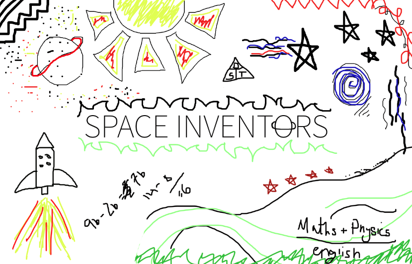
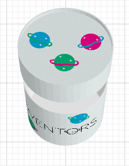
After plenty of experimentation for the perfect logo, I have decided to settle on the one shown below. The research of doodling as a design really inspired me and I have decided to continue down that route. Therefore, in order to provide some product branding, if all my design elements consist of similar colour schemes and approaches to space, then they will become more appealing to my audience demographic.

Screen Shot 2016-02-24 at 17.40.55

The final logo is quite minimalistic, however includes little doodles. I used to spend time in school turning letters in text books into different shapes etc because they were a visual aid already provided. Therefore, I thought playing on the letters and including elements of space was appropriate.

COLOUR SCHEME:

Screen Shot 2016-02-24 at 17.47.06

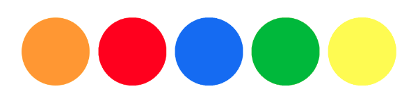
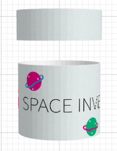
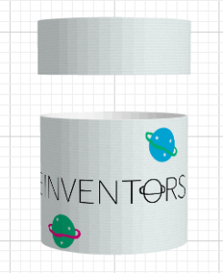
I have decided to use primary colours throughout this project. This is because they are very easy to distinguish between, they are very familiar to my age demographic and they are usually colours already found in school art and craft tools. All the poster paints we had in school were never low on these colours, especially as mixing them would result in making another colour included anyway. I love how bright and eye-catching they are. They aren’t something that follows a colour scheme trend, or colours that might potentially make a difference in the realms of design, they also don’t particularly match. However, they are appropriate to both my subject area, and my audience demographic that i’m trying to appeal to most. I believe sticking with these colours, on a white back ground will give them the justification they deserve, as they will pop and stand out to those about to interact with the product.

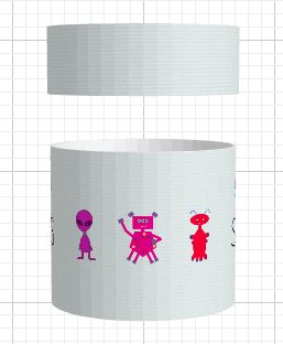
Usually when one thinks about space, you have all these dark blues and purples, that represent night time etc. However, I would like to add a modern twist to the way we see space.  It might be easier to learn and interact with, if we detach it from real space itself. One can become overwhelmed by the knowledge and power than run alongside physics, and sometimes it is difficult to wrap your head around things. Therefore, if the learning aids are more visually appealing, they will enhance the experience and potentially encourage children to want to learn more.


Finalising Designs

Why Webgl?

For the website I intend to create, as the digital instruction manual, I have decided to incorporate Webgl as a basis for animating and texturing the planets. After my tutorial with James on Monday, we spoke through my idea in more detail and discovered that in order to reach out to my target audience efficiently, I need to avoid plug-ins.

Since wanting to create a workshop experience for young children in primary school, it would be more effective if this digital experience was accessible without having to download a particular software or plug-in.  My intended audience of primary schools (buying the kit to accompany science lessons etc) will be more inclined to take part in the workshop, if they have less to pay for and less to access, as a means of the workshop taking place effectively.

I haven’t overly used Webgl before, so i’m spending this evening watching tutorials on the basic stages. http://learningwebgl.com/blog/?page_id=1217 has many different videos that you can progress through, and improve upon already inherited knowledge in the area. I intend to finalise on my designs and then begin the build of this website next week sometime. I want to complete each stage of this project thoroughly before progressing onto the next step, in order for things to work more fluidly. However, due to continuing the research of this, right the way through, there will always be space and inspiration for things to take a new turn.

Why Webgl?

Doodle research

After some research into Justin Bieber’s music video, I decided to have a little doodle myself. I went with the style of what doodles might look like on the front of a school science book, attempting to make them as random as possible. I did this on photoshop and explored the brush and pen tools, however due to the drawings purposely being childlike, I didn’t experiment much with the software. I really like this design style, although I intend to explore it more thoroughly. This research could include looking through old school books of mine from primary school and checking for any doodles, so that the design will reach my target audience as much as possible.

Screen Shot 2016-02-21 at 16.12.58

I like the use of the eclectic and bright colours, as they connote symbols of playful colouring in books and doodling as a child. The lack of colour scheme is effective, due to children usually choosing colours to use at random. I am yet to decide on whether I will go down the route of a colour scheme in order to provide my product with some consistent branding. I may choose 5-6 colours and stick with those, including basic reds, yellows, green and blues. Although previous designs included more of a scheme, following on from pink, blue and green.

More research to take place on this style of design, however I really like it and really think it works well alongside the product I want to create.

Doodle research

packaging research

Due to wanting to progress down the route of creating an ‘instruction manual’, that ultimately creates a workshop experience. I wanted to briefly look at packaging designs, as all the pieces that you would need would be included. For example, paint, balls, sticks, glue, paintbrushes, sketch book, information to link to the webpage etc. Therefore, if each child/school had one of these boxes, it would not only potentially look great as decoration, it would be great for arts/crafts storage afterwards too.

I used designyourownpackaging.com to make a quick mock up of what it could potentially look like. I haven’t nearly completed the design stage and believe that will continue to progress, right the way through this semester. However, I made do with what I already had.

I decided to go with a cylinder shape, due to the obvious connotations of working with spheres, as well as looking more attractive. I believe the logo (not yet complete) would be centered, being wrapped around the box and play the main part of the design. Overall, I like how simplistic this design is, and even though this is just a prototype, it ties in nicely to my overall ideas.

Screen Shot 2016-02-19 at 15.44.02

Screen Shot 2016-02-19 at 15.44.13


Screen Shot 2016-02-19 at 15.44.27 Screen Shot 2016-02-19 at 15.44.42

packaging research

where are u now…

I was recently at the gym and noticed a really awesome looking music video begin playing on one of the television screens. I decided to take note of the artist and take a look at it once I was home. I was not aware that it would be a Justin Bieber song, but all that aside, the animation and graphics are so querky.

During the music video, Justin Bieber is accompanied by doodles and animations going on in the fore/background. I believe this was done using a green screen and doesn’t look too difficult to re-create.

Screen Shot 2016-02-19 at 15.05.55

Screen Shot 2016-02-19 at 15.05.38


Above are two screenshots of the video as it was playing. The animations move so quickly that it’s hard to really see what is happening. However, this style of work sparked my own imagination. Due to not actually creating a game for my final hand in piece this semester, but wanting to create one in time for the European Youth Awards, I have decided that alongside my ‘Digital Instruction Manual’ work, I will create a sort of advertisement, for the games future. This will tie in nicely with the progression of ‘Space Inventors’, as it will show how it started, however the future that it has as well.

I have managed to team up with a games computing student, that would like to help me create this game, ready for the awards deadline in June. I believe showing this to potential judges will provide insight to the originality and expressive side to this project.  After all, the entire point of creating this project, was to encourage young children to remember to use their imagination and creativity when interacting with technology. What better way to show this, than by mixing art with technology on screen.

Screen Shot 2016-02-19 at 15.05.11Screen Shot 2016-02-19 at 15.04.59

where are u now…